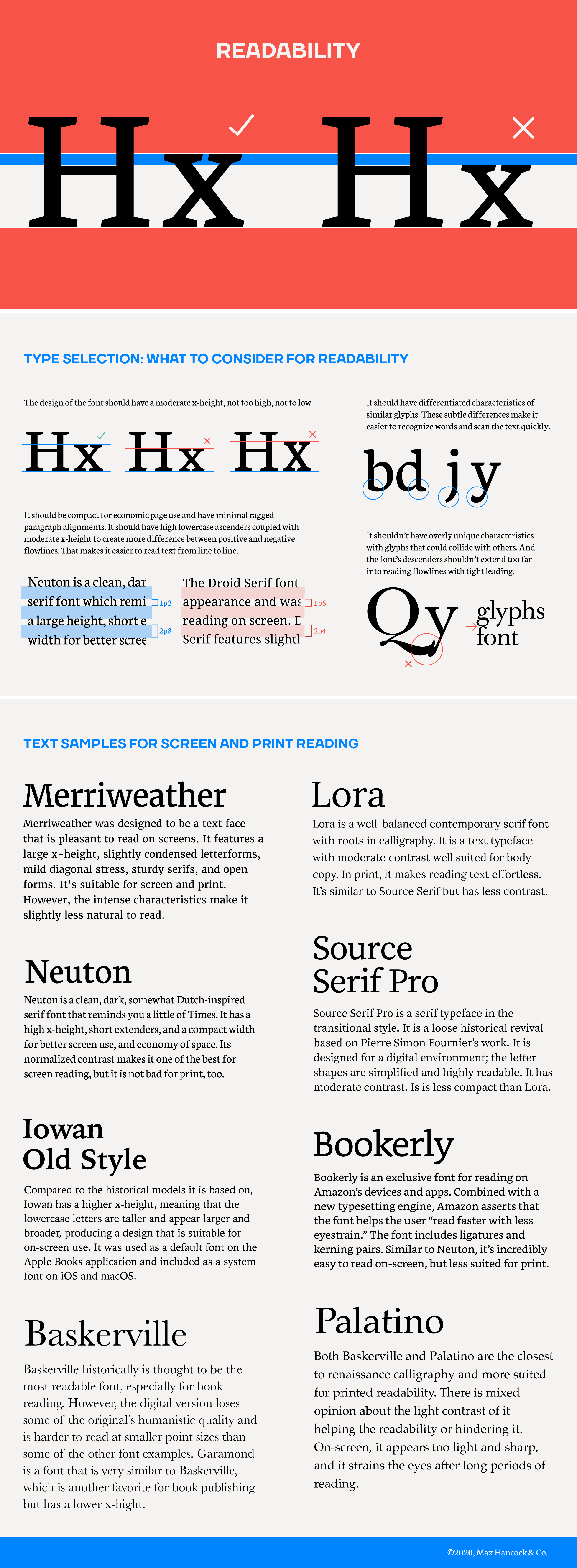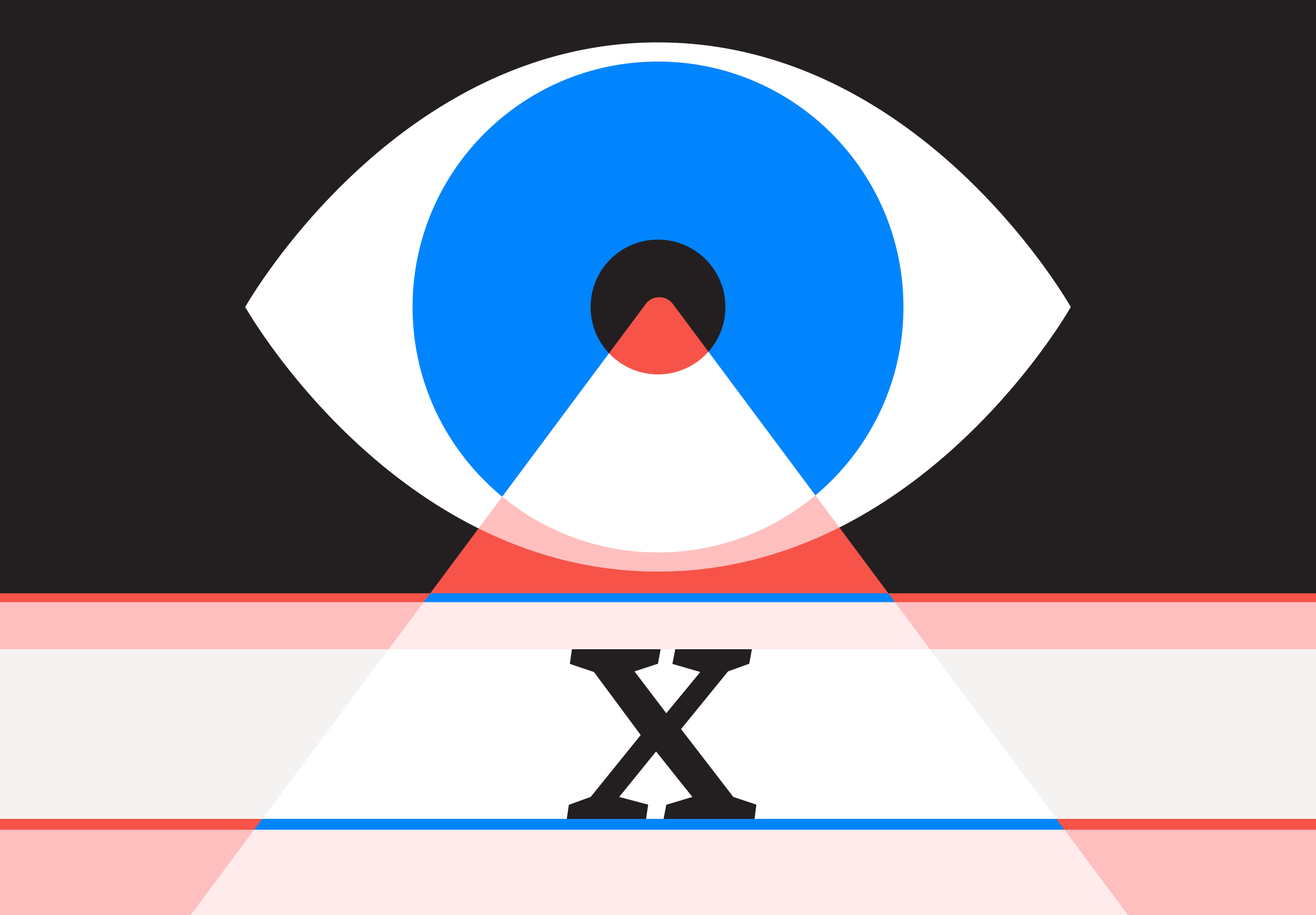

What makes a font legible? In my research, I found four simple things to look for when selecting a font for readability. The most significant thing to identify in a font is the x-height. The x-height, relative to the H’s crossbar height, is a great way to test a font readability. Typically, a moderate x-height yields the best readability. There are other factors, such as a font’s contrast, that is, the level of thick-to-thin contours of a font. Light type contrast is harder to read on computer screens, but easer to read in traditional print. What makes a font great for readability is the balance of many factors. Mostly, the balance of the x-height and contrast is what makes a font great for reading.
This journal post is part of a new series about font design and research. I hope you find it as useful as I do.
Research to Note
- Fonts with moderate x-heights, not too high and not too low, appear to be more legible, but there are some exceptions, like Iowan Old Style.
- There are more subtle aspects that make a font readable, like the size of the serif, length of descenders, and size of apertures and counters.
- Similar glyphs should have differentiated characteristics. For instance, the b and d should look different as well as p and q. The j and y should have different descenders.
- Generally, the font should have some personality, but too much character can be distracting and cause eyestrain.
- Descenders shouldn’t flair so much that they collide with other glyphs.
- The font should work when the text is compact, requiring less leading, providing more copy on the page.
- The font’s contrast should be balanced with its unique characteristics, but it shouldn’t impose itself on readers. It should feel so natural to read that you no longer notice the design of the font.
- Paragraphs should have minimal ragged-right paragraph alignments.
- Fonts to study for readability: For screen and print, study Merriweather, Lora, and Source Sans Pro. For mostly screen, study Neuton, Bookerly, and Iowan Old Style and Georgia. For mostly print, study Baskerville, Palatino, and Garamond.