
By Max Hancock.
Graphic design layout often involves displaying and arranging some visual elements within a composition. But another way to understand what makes a composition is to recognize what parts are not visible. I’m talking about more than negative space. There are parts of a layout that are invisible because of the way we look at them and how we think about them.
Examine figure 1. You’re probably thinking, “I see two rectangles, or maybe an equal sign.” In fact, there is more to this simple image—just a little more than you think is there. It’s not always the case, but there are probably parts of a layout or image that are designed to be out of view, even though it’s not entirely obvious to you. For instance, certain color combinations create vibrations, adding a glow to the composition. That glow isn’t physically there in the layout, but perhaps it was designed to be there. Or sometimes there is more in the spread that doesn’t fully register in the way you think about it, or rather, hasn’t manifested a thought because more context is required. In fact, for me, the realization there are ways to design the invisible was a fundamental concept I learned and used early in my career, and it is part of the design methods I use today. I’m still a student of this subject, but what I do know for sure is that designing what isn’t there is just as important as designing what is there.
There are a variety of ways one can be creative with ‘the invisible,’ and I can’t cover it all here, but I’ll break it down in the ways I understand it, through a few of the following examples…
The Space Between
Looking at figure 1, most people recognize first what is positive on the page—the two rectangles, but the space between the two rectangles is the third shape within the layout. The negative space between the positive shapes is an important part of the design because there would be no two recognizable parallel rectangles without that space between them. With any design that is simple or complex, keeping track of the negative space between all of the elements is a helpful method for creating well-balanced designs. For example, with a type design, how well negative space is balanced with the positive shapes is what makes a great font. You need to study the space between the glyphs carefully so that words don’t stop the eye when reading the text (figure 2). Or another example, you may be designing a website that encompasses several blocks of information and images. The margins work like invisible visuals that are just as powerful as an image. Wide margins create a sense of calm, while tight margins create tension (figure 4). Logo design uses the spaces between elements and negative space to unify the whole—that’s called design gestalt. Think about the arrow symbol within the FedEx logo, and then the figures around it that hold it together (figure 3). The ‘space between’ has a 3rd dimension too, in that the material a design uses evokes emotions that aren’t seen but felt. If you broaden your thinking about the 3rd dimension in this way, you can, to use a metaphor, cast shadows of meaning between elements. When the ‘space between’ is used to help and hold the layout together, it generates a unified whole that is pleasing to the eye and is an experience for the mind.
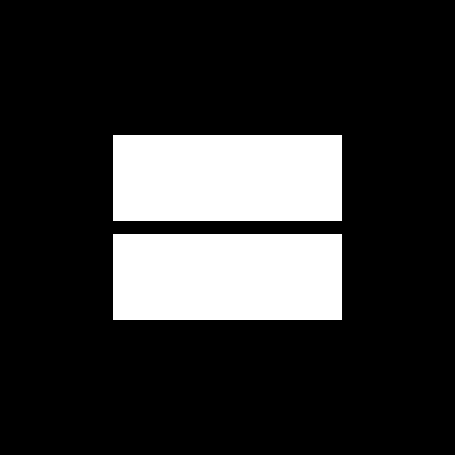
Fig. 1 – Is this an equal symbol or something else? And, does the space around the shapes change your perception of it?
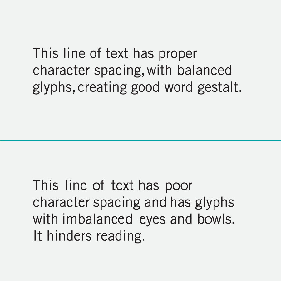
Fig. 2 – Unbalanced negative space between font characters stand out and cause the reader to pause.

Fig. 3 – Shapes trap negative space and create visual gestalt. And, sometimes meaningful symbols can be infused within the negative space. The Fed Ex logo has a hidden arrow shape, and the Toblerone logo has a hidden bear.

Fig. 4 – Designing with negative space, tracking visual continuity between elements. The space between the elements can influence the way we feel when reading a piece.
Out of View
How a designer decides to reveal the subject of a composition can be controlled by how he or she crops it. In modern design practices, it became popular to crop the main subject of a composition so that only the most essential part of it was revealed. Using extreme cropping makes for a greater visual impact. Why? Because it is left to the person looking at the image to complete it with their imagination. In figure 1, there is an equal amount of empty space around the two rectangles. By cropping it this way, one could imagine that this ’empty space’ is infinite. However, in figure 5, because of how the rectangles are cropped, the viewer is left to wonder if the rectangles continue outward. Cropping can change our point of view, and in some cases, change our opinions of what we are looking at. If you didn’t know about the original image, you could assume it is something different. For instance, the equal symbol, cropped and skewed like this, could be interpreted as two roads.
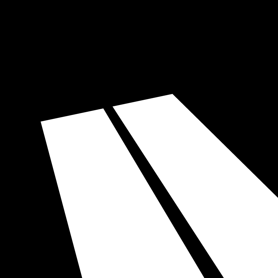
Fig. 5 – The equal symbol is cropped at an angle. By cropping it in such a way, has it become something else to the viewer?
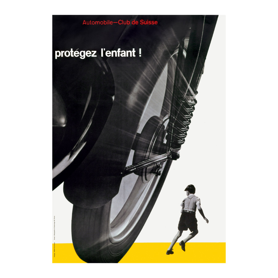
Fig. 6 – Josef Müller-Brockman used extreme cropping to great dramatic effect, showing only the essential subjects, and leaving the rest to imagination.

Fig. 7 – Some color combinations create distinct vibrations when paired together.
The Hidden Vibrations
Understanding the benefits of cropping and negative space is the usual case in what makes a composition work well, but designing what I like to call “the hidden” is a little more difficult to comprehend. Here, we are getting at the subtlety of what we put into our designs. For instance, if you look at figure 1 long enough (focus intensely on it) you will see that I design a glowing halo around the outer edges of the rectangles. In fact, there are actually no halos physically added to the design. What actually makes the halos is the contrasting vibrations of the colors and the shape-to-background relationship, and how your eyes react when fixated on these things. In a playful way, I call these vibrations a design’s aura. Because I know of this effect and what it is doing to my design, I think of it as part of my design. You can also use this to avoid layouts that have too much ‘aura,’ that is too much undesirable contrast (figure 7).
The Otaku Mind Trick
While I lived in Singapore, I met a designer who was also a self-described otaku (someone obsessed with comics and anime). He showed me how some artists could hide images and symbols in plain sight, perhaps in the foreground or right in the center of the composition. Those images are bypassed, and you do not see them because the main imagery of the composition (the focal point) takes priority in the visual experience, but that isn’t the only reason why. By using perceived expectations one might have in what they are looking at, a designer can play tricks on the eye and hide design elements in plain sight. I call this the “Otaku Mind Trick,” just to remind myself of it. There are many practical ways to fool the eye, but it is a learned art to do it right. It’s a little like camouflage, but camouflage on steroids. Images can be hidden within images, similar to how a magician creates a distraction to perform a trick to create an illusion (figure. 8 & 9).
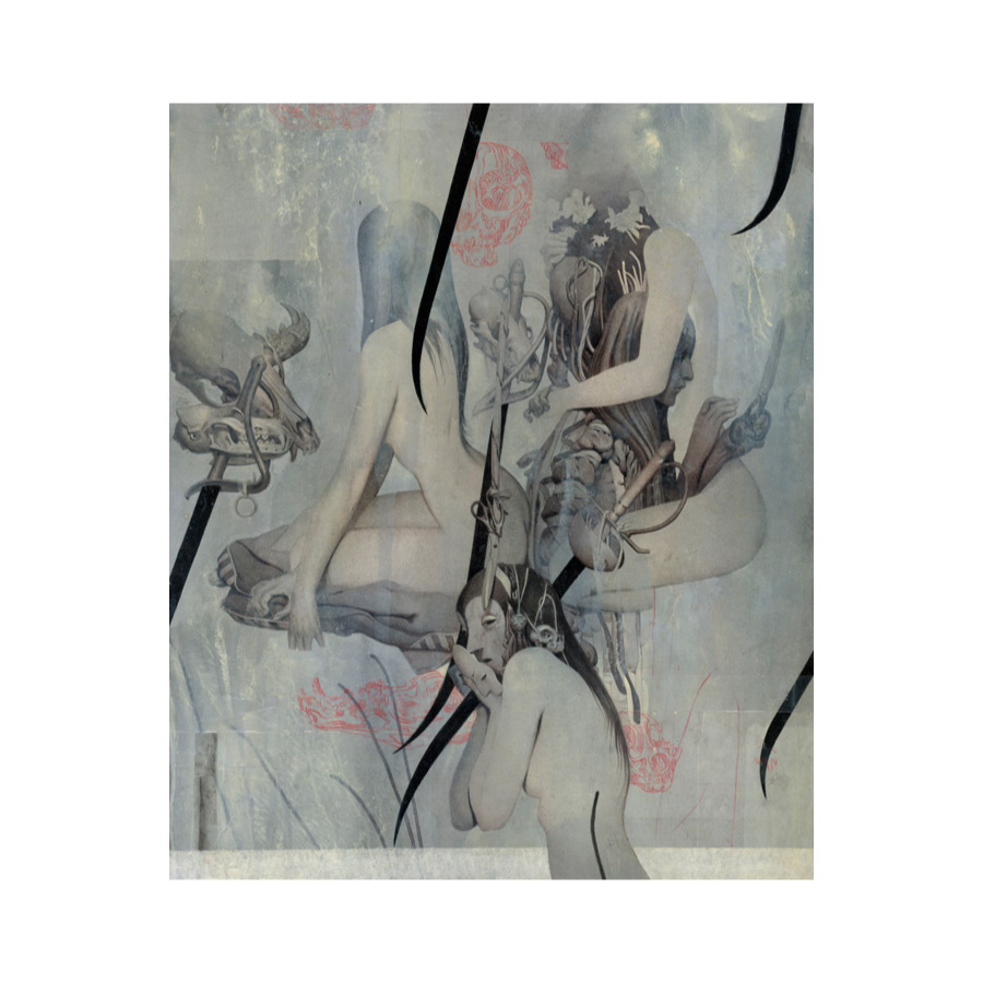
Fig. 8 – João Ruas uses ‘the otaku mind trick’ to hide images within images. At first glance or even with a hard stare, many people don’t see the figure under the woman’s arms, or notice the pattern of swords, or that a mask replaces the hand.
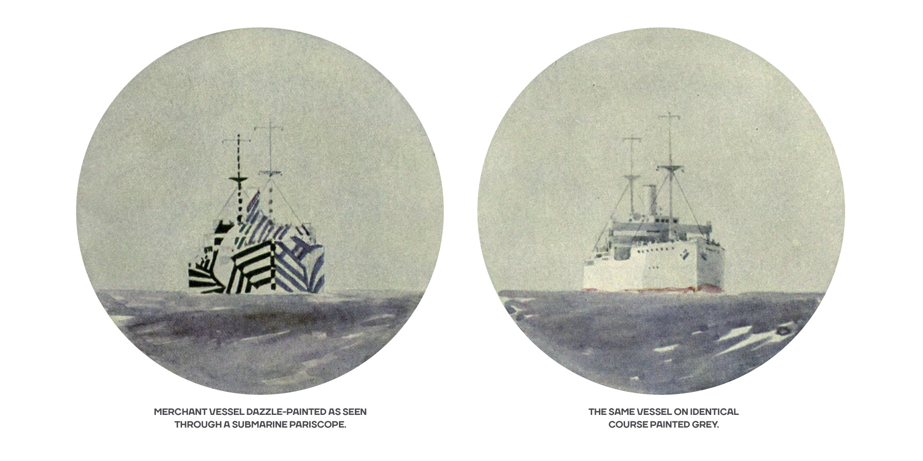
Fig. 9 – In World War I, ships were painted with shapes at seemingly random angles so that it was harder to tell what angle the ship was heading. This effect, called dazzle-painting, would fool U-boats to fire a torpedo too soon or too late, missing their target.
The Mental Image
How the viewer interprets your layout is sometimes brought on by imaginative thinking of what isn’t present in the composition. Especially if a design is ambiguous enough, the viewer will interpret any plausible meaning to the visual experience they are having. To make sense of what they are looking at, the viewer will fill in the missing gaps with their own mental image. Looking at figure 1, you might think, “This is a large equal sign, or maybe a window, or perhaps I’m looking down at the top of two buildings.” As more elements are added to a composition, it brings validation to the viewer’s mental image (figure 10).
In interface design, a practical way of hiding/storing functionality is to follow through with the mental image, making a mental model. A mental model is a folder, a tab, a trash can icon, those things that exist in the physical world mimicked on a computer—helping us understand the things we are viewing. On a computer, the files aren’t really in a folder, but the mental image of it being there gives us some comfort, and within that metaphor, makes it easier to use. In graphic design, labels and page guides create a mental image of direction and help guide the reader. In advertising and marketing, the mental image can be used to manipulate the target audience’s response. In an advertising brochure, the picture on the first page can reinforce the call to action on the last page.
Fig. 10 – More features are added to the image to give it more definition.
The Hidden Voice
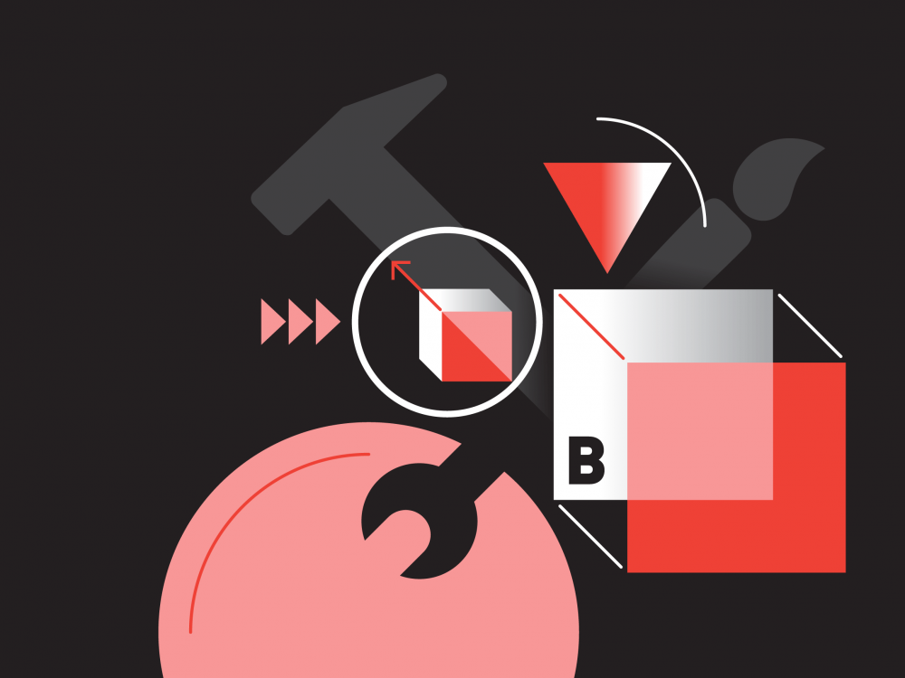
Every picture has a hidden story. For example, an image of a fisherman is loaded with a story. That picture tells the time of day, the atmosphere around him, the country he is in, and suggest how experienced he is. The lesson here is that an image of a fisherman is never just an image of a fisherman.
We’ve all heard the phrase “a picture is worth a thousand words,” meaning that you should let the photo tell the story. But in layout design, when photos are paired with content, the combination is compelling—this is graphic design. But the photo on its own helps the reader understand what might be going on within the text before they read it. And this is why understanding the minor, almost hidden nuances of a photo is very important. If you miss these subtle cues in the image, you might be miscommunicating your message. Not only does a photo help tell the story, but the style of it can set the mood. Overall, the photo can communicate so much about a subject in style and traits, and it can affect your audience subconsciously—emotionally.
Text and image together can create a communication style that can change your anxiety level with a bold and caustic layout, or decrease it with airy or playful design approaches. This harmony of type and image can be thought of as the hidden stylistic voice. Some designers discover a hidden stylistic voice by first making mood boards before implementing a completed piece (figure 11). Mood boards are a great way to cobble together images, colors, shapes and type styles you might use—to test how they affect you emotionally. It’s a way to get a gut feeling about a design approach, using intuition. A designer should always specifically know what they want to communicate, but in the beginning stages of the process, it’s not always clearly seen without some design exploration. Whatever the process, uncovering the hidden voice is crucial for making designs work well for your audience.
Font selection alone can conjure a hidden voice. Typographic choices can create a visual voice— captured in the text. Those typestyle choices alone can convey to the reader that a piece is serious, or utilitarian, or historical and so on. But how do you identify the voice a font has before you start to use it in your layout? It’s a bit novel, but one way to discover a font’s voice is to compare it with the style of cup or utensil. In figure 12 you can see a sample of some comparisons. A wine glass, one you might use for important ceremonies, is similar to Adobe Caslon, which is also often employed in designs that need to be taken seriously. And continuing this process of matching fonts to cup types, the goblet is like blackletter—casual but historical. And, the common coffee cup is like the humanistic font face—used in everyday products. Would you use a regular coffee cup for wine at an important ceremony? No. And similarly, you wouldn’t use Adobe Caslon in a casual layout design. These voices, although not entirely visual, are felt through experience, informing your design choices.
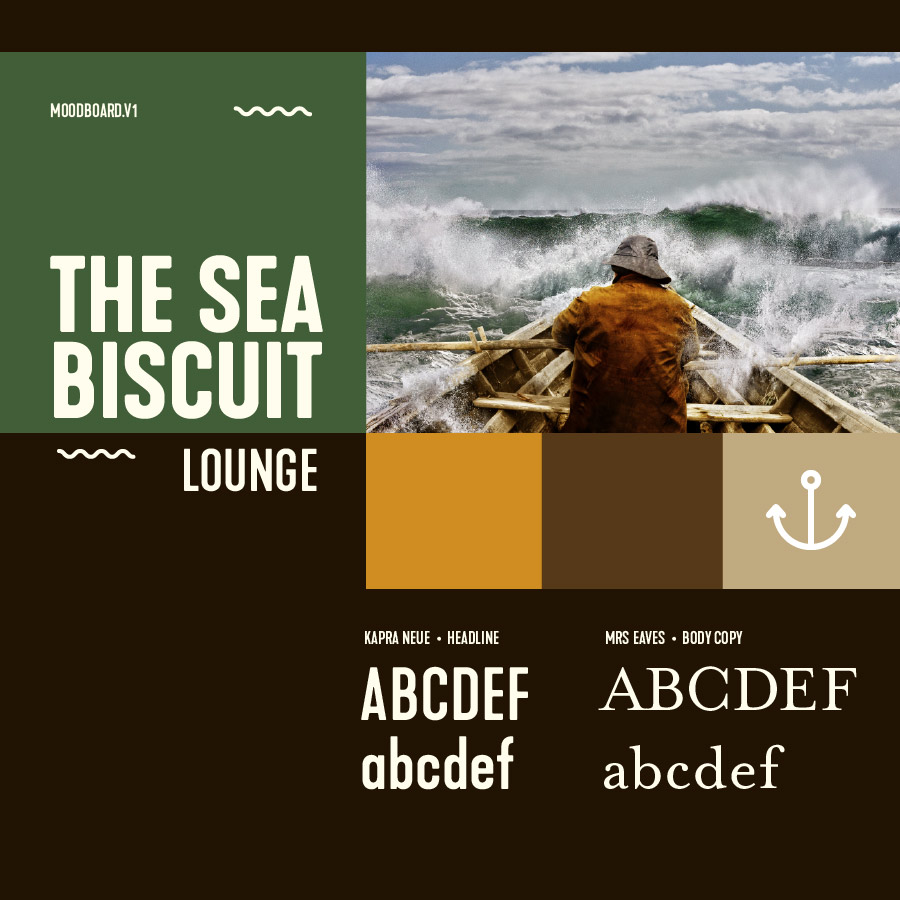
Fig. 11 – In design planning, mood boards are made to uncover a potential stylistic voice before an actual layout is started.

Fig. 12 – Comparing a font to a tangible object, especially if it’s one we have interacted with before, matching its characteristics, helps to uncover its visual voice. When the most appropriate type is chosen, it disappears, similar to how the perfect voice melds with music.
Good Design Is Invisible
A universally understood, well balanced and beautiful design becomes invisible. Some confuse invisible design with minimal design, but it is not the same. Minimal design reduces everything to just the essentials. There’s a little more to it than that, but that’s basically it. Invisible design, be it a product or a website, happens when its use is natural, it feels like it’s part of us, so much so that we don’t think about it—it’s invisible. If you can’t see invisible design then how do you design it? By doing the hard work of learning what works and doesn’t work. A practical way to design with “invisible design” is to look at a bad design and ask a question. For example: “Why does it need to be placed there?” … “If I do it that way, does it make the reader stop and think unnecessarily?” And, with practice and good intent, your answers to these questions will lead you to make great designs that are “invisible.” Answers like: “The green color means active, but I’ll add a circle around this icon so people who are colorblind can also tell that it’s the one that’s active.” You see, a good “invisible” designer know’s they can’t be the target audience because they are too attached to what they are making. An invisible designer understands that real invisible designs are solutions that work well for all types of people.
Conclusion
To design with the invisible, it takes a lot of practice and learning what works and what doesn’t. Learning to see what’s hidden is a skill you can’t learn through technique alone. It’s more psychological than you might think, hidden in the subconscious state. It’s why some movie directors are better than others. Bad movie directors can mimic Stanley Kubrick’s methods and techniques, but the outcome is not the same because they didn’t spend the time to understand what’s invisible. They don’t see like Kubrick.
In the end, this is only an introduction to invisible design. It’s not everything and only the start. All I can say here is that if you try to use these techniques, use them with purpose. Invisible design that’s only there as a gimmick ultimately confuses your audience—it’s a failed design.
Lastly, I’m sometimes surprised when a designer doesn’t mention what is hidden when talking about their projects. People are always delighted when you point it out to them. Maybe, like a magician, it’s because they don’t want to reveal the methods behind the magic.